
Alfa Romeo takes the lead with dashing new livery
2020 Formula One tests Barcelona, Alfa Romeo C39, Räikkönen.jpg” by Artes Max from Spain is licensed under CC BY-SA 2.0
March 24, 2021
The teams for Formula 1 in 2021 have recently revealed the liveries for this season, showing the cars in the colors and designs that will be used for the rest of the season. Most are fairly well designed, but there are those that are better and some that are much worse.
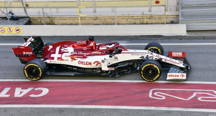
I think my favorites are Alfa Romeo, Alpha Tauri, and Alpine. Alfa Romeo’s livery has a nice red on white, which is a reverse of their previous liveries, and that is a welcome change.
Alpha Tauri has dark blue on top of a white body, with its logo featured prominently, similar to Alfa. There are a few minor changes I would make, including changing the wheels to black, again like Alfa Romeo.
Alpine’s livery is nice, albeit somewhat predictable. It’s similar to what they showed on their winter teaser livery, and I’ve seen ways it could have been done even better, with more interesting logos and designs, such as incorporating the logo into the livery design more.
On the opposite side of Alpine is Williams, with an artsy, abstract design that no one could have predicted, is stirring up quite a bit of controversy because of its design. I personally am a fan of the design, and see no real flaws in it.
Mercedes has kept its black look from last year with some changes, such as the AMG logos all over the rear fin. I’m a big fan of the black livery, both because of it supporting the BLM movement, and because it looks really good on the car.
Mclaren haven’t changed much, but their car still looks fairly nice. I’m glad they keep their rainbow striping on the side, and the subtle changes definitely add to the design.
One of the other controversial liveries is Haas, with a livery that looks to the Russian flag, but totally different for legal reasons. I still think it looks great.
Aston Martin has a nice livery, but was also predictable. The metallic green with a pink/red stripe is almost exactly how I imagined it would look, and I wish they would have done something more interesting.
Red Bull is almost exactly the same as last year, with the only exception being the removal of Aston Martin logos.
The livery I haven’t covered yet is Ferrari. While I don’t really have an opinion on the red gradient on the back, I am definitely not a fan of the green Mission Winnow logo. It matches absolutely nothing on the car and looks so out of place. And to add to that, the numbers are basically comic sans, a horrible font. I feel like the green might have worked if there was some white on the car to give it more of an Italian feel.